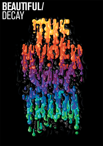
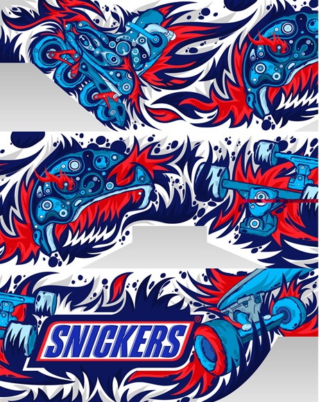
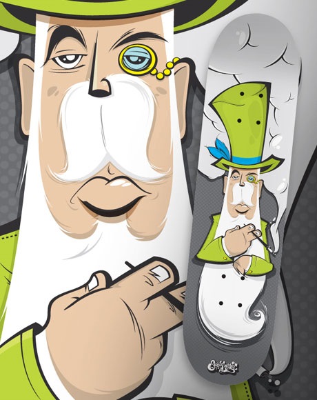
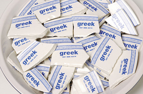
After the feedback i'm going to make a few changes so stay tuned. It'll be happening over the next few weeks. Going to get them properly printed.
Your graphic design portfolio is a representation of yourself and of your skills as a graphic designer and it will become an essential part of landing your graphic design dream job! This guide will help you fine tune your portfolio to make sure its in top shape for your upcoming interviews!
1. Choosing a Portfolio Case
Choosing a case for your work should be the first step of creating your graphic design portfolio. The style of the case and the size of the case will play a role in what will be inside. You don’t need to have the most expensive portfolio in the world, but it should be nice, new and look professional. Don’t show up with your parents beat up portfolio case that’s been sitting in the attic for 10 years!
Be sure to also take into account the size of the pages to see if it will be a good size to display the work you have. For example, if you do a lot of poster designs you may want a larger case so you can print your designs at a larger size.
2. Your Portfolio’s Background Paper
The background paper in your case should be a neutral color, most likely a white or light grey and should be used throughout your entire portfolio. Try to avoid switching background colors because it can be shocking to the view and throw of the flow of your portfolio.
3. Consistency
Like your paper usage, the work and placement of your work should be consistent as well. If you center all your designs on each page make sure they are center everywhere. Try to keep spacing even around the sides as well. Showing errors in consistency your portfolio will reflect what your design work could be like.
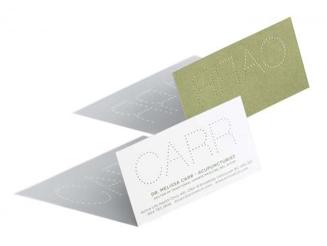
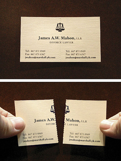
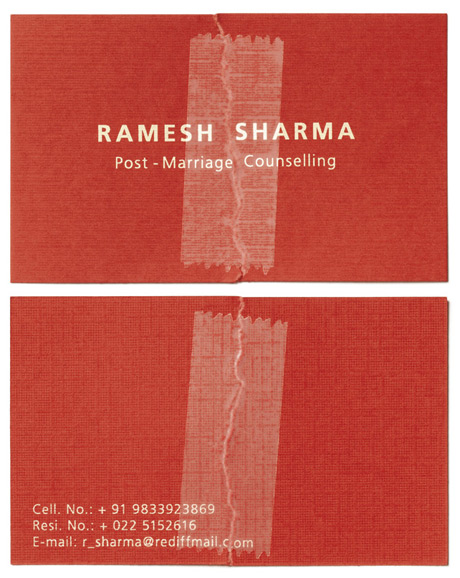
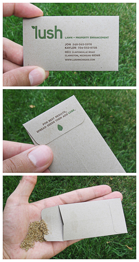
4. Including the Right Designs
You should spend a lot of time choosing the right work for your portfolio. If you are in design school be sure to have your teachers help you out, or ask your designer friends for input. Your work should be current and you should tailor the type of work in your portfolio to the job you are applying for. If you are applying for a job at a magazine, be sure to include projects related to this area of work. Don’t show up with a bunch of CD covers and poster designs and no magazine covers or spreads.
5. Strong Start
When the viewer opens your portfolio you want to “wow” them, but the key is to keep them “wowed” throughout the entire presentation. Pick one of your strongest pieces for the opening page, which is usually a single page and not a spread. Its better to keep your resume and any other paper work in the back or in a separate folder.
6. Strong Finish
Ending strong is just as important as starting strong, if not more important, because you want to leave a good visual memory in the mind of the viewer. You should include another very strong piece at the end. Your portfolio should get stronger as it goes on, not weaker!
7. Placement of Work
Your work should be trimmed neatly with no rough edges and placed firmly on each page. You should use some sort of sticky tack or removable double sided tape so your work does not shift around on the page. The last thing you wanna do is open up a portfolio for an interview and see all your work jumbled around and falling out of the page slips!
8. Labeling Your Work
More often than not, interviewers will ask you to leave a portfolio at the office for future viewing so labeling your work with a title and very brief description can help refresh their memory if they begin looking through your portfolio again. Labels can also serve as notes for you while you talk about your work. Keep the labels consistent; in the same place, size and fonts.
9. Talking About Your Work
It is very important to be able to speak about each piece in your portfolio for at least a few minutes each. Know who it was for, what the project details were, what you did, what the concept was, what style you used, why and so on!
10. Practice Makes Perfect
You may know everything there is to know about your work, but being able to speak about it confidently is a whole other game. Practice in front of friends, family and even strangers so you can get over any uncomfortable feelings sooner than later. The more your practice the better your presentation will be! Just remember not to ramble on for too long on about each project.
11. Networking
Networking is an essential aspect of any career, and the more designers and art directors you know the better. Its great to be able to show your portfolio to honest people in the field. Most designers and art directors are used to giving honest, non bull-crap critiques so their opinions can be very valuable!
12. Maintaining and Updating your Portfolio
Keeping you portfolio current is important because you could unexpectedly get fired, or your dream job might pop up out of no where! You need to be ready at a moments notice; so update your portfolio once in a while and this includes replacing any bent or ripped pieces of work and cleaning fingerprints and smudges from the clear page slips.
Tell us About Your Experiences!
We would love to hear about your graphic design portfolio, portfolios you have seen and interviews you have been on in the comments below! Feel free to include pics of your portfolios in the comments as well and links to your portfolio websites.


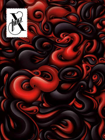
 The colours look so flat and dull in RGB jpeg mode. Lame.
 Black works well. I think this will work with the symbol i've been working around. I want to start a division or section of Rinse that produces t-shirts. Heres the symbol based upon the symbol for rinse cycle on a washing machine, which again fits in with the idea of t-shirts and clothing.


The UPS logo is one of the most recognized logos in the world. The company along with Fedex has revolutionalized the way in which packages are delivered around the world. UPS has changed its login 4 times in the 96 years of the company's existence.
|
The new logo was designed by international brand consultancy Future Brand, which has worked with clients such as Walt Disney, GlaxoSmithKline, MSN and British Airways. The logo retains the famous `UPS brown' but replaces the package with a golden arc on top of the shield. The intention is to convey an impression of "freshness and excitement" that reflects the company's new vision of `synchronised commerce'. The new logo draws from the company's history, leverages its brand equity and uses its traditional colours to suggest a company that is thinking ahead and is leading the way in package delivery and other businesses. "The arc at the top and the use of light suggest energy and forward-thinking qualities on a global scale. The redeveloped logo is, in fact, just the cornerstone of the company's reinvigorated visual system.
UPS' association with the colour brown goes back to the early years of the company's existence. When the company expanded its delivery fleet, its founders were faced with the task of deciding on what colour to paint their vehicles. Following some discussion, they zeroed in on brown or yellow as the colours most appropriate for their fleet. However, one of the founders pointed out that brown was a better bet. In fact, railway carriages of the time were painted brown simply because it was easier to keep them clean, he explained. And so brown it was! In fact, the company has the colour brown trademarked and it appears on shade cards in the US as `UPS brown'!
The McDonald's Golden Arches logo was introduced in 1962. It was created by Jim Schindler to resemble new arch shaped signs on the sides of the restaurants. He merged the two golden arches together to form the famous 'M' now recognized throughout the world. Schindler's work was a development of the stylized 'v' logo sketched by Fred Turner, which was conceived as a more stylish corporate symbol than the Speedee chef character that had previously been used. The McDonald's name was added to the logo in 1968.
 This mark is a representation of the Earth. We call it a "globe mark" because it expresses the infinite expansion of Konica Minolta and the offering of innovative value to customers throughout the world.The elliptical form expresses the offering of reliability and security to customers and the harmony of our wide-ranging technological expertise. The five lines represent light beams and express our wide-ranging technological expertise in the field of imaging.The blue color of the symbol mark expresses creative innovation. We call it "innovation blue."


 Simple/Straight forward/ Timeless
 Instantly recognisable.
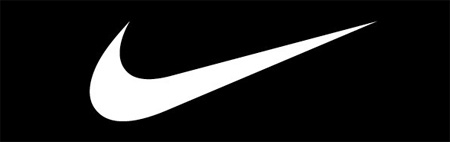
The Nike "Swoosh" is a design created in 1971 by Carolyn Davidson, a graphic design student at Portland State University. She met Phil Knight while he was teaching accounting classes and she started doing some freelance work for his company, Blue Ribbon Sports (BRS).BRS needed a new brand for a new line of athletic footwear it was preparing to introduce in 1972. Knight approached Davidson for design ideas, and she agreed to provide them, charging a rate of $2 per hour.
In June 1971, Davidson presented a number of design options to Knight and other BRS executives, and they ultimately selected the mark now known globally as the Swoosh. Davidson submitted a bill for $35 for her work. (In 1983, Knight gave Davidson a gold Swoosh ring and an envelope filled with Nike stock to express his gratitude.)The logo represents the wing of the Greek Goddess.The Nike logo is a classic case of a company gradually simplifying its corporate identity as its frame increases. The company's first logo appeared in 1971, when the word "Nike," the Greek goddess of victory, was printed in orange over the outline of a checkmark, the sign of a positive mark. Used as a motif on sports shoes since the 1970s, this checkmark is now so recognizable that the company name itself has became superfluous.
The solid corporate logo design check was registered as a trademark in 1995. The Nike logo design is an abstract wing, designed by Carolyn Davidson, was an appropriate and meaningful symbol for a company that marketed running shoes. The "JUST DO IT" slogan and logo design campaign communicated such a strong point of view to their target market that the meaning for the logo design symbol evolved into a battle cry and the way of life for an entire generation. Isn't it amazing how a small symbol we call a logo design can make a company into a huge success.
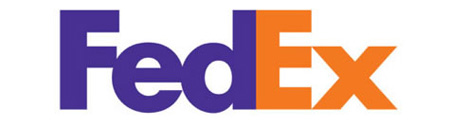 FedEx is an abbreviation of the company’s original name, Federal Express, which was chosen to symbolize a national marketplace and help in obtaining government contracts. The original Federal Express logo was designed by Richard Runyan in 1973. It consists of the name ‘Federal Express’ in a diagonal position with blue and white background. Following the expansion of the FedEx’s courier business into a company offering overnight courier, ground, heavy freight, document copying and logistics services, FedEx logo experienced an innovative change. In 1994, Lindon Leader of Landor Associates created the new FedEx logo which has become a highly recognized corporate symbol of FedEx Corporation. Behind the FedEx logo’s simplicity, lays an arrow located in the negative space between the ‘E’ and ‘X’ pointing rightwards. While the arrow in the FedEx logo becomes quite obvious when pointed out, it sure is neglected by many. This arrow in the FedEx logo has been used as a form of subliminal advertising of the brand, symbolizing forward movement and thinking.
Since first appearing in the early 1900s, the Shell logo has moved from a realistic rendering of a pecten, or scallop shell, to today’s bold shape with distinctive colours.
Both the word “Shell” and the Pecten symbol may have been suggested to Marcus Samuel and Company (original founders) by another interested party. A certain Mr Graham (of apparent Scottish origins) imported Samuel’s kerosene into India and sold it as ‘Graham’s Oil’. He became a director of The “Shell” Transport and Trading Company, and there is some evidence that the Shell emblem was taken from his family coat of arms.The logo has become so recognizable that it often appears without the company’s name to identify it.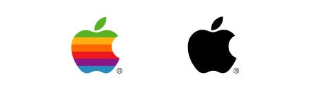
The original corporate Apple logo from 1976 to 1999.
It has also been suggested (notably by Sadie Plant in her book Zeroes and Ones) that the idea for the Apple logo may have come from the story of the death of Alan Turing who was found dead after he had taken a bite of an apple laced with cyanide. Another theory is that the missing bite is a reference to the Fall of Man, representing the acquisition of knowledge.
One final thought is that the idea came from the fact that computers store information using bits (binary digits), 8 bits is called a byte, hence the 'byte' out of the apple.

Coca-Cola is the world’s most popular soft drink. Sold in more than 200 countries, it is produced by The Coca-Cola Company and is often simply referred as Coke. Originally intended as a ‘patent medicine’ when it was invented in the late 19th century by pharmacist John S. Pemberton as a ‘coca wine’, Coca-Cola has dominated the worldwide soft drink market for decades now. The Coca-Cola logo, like the product itself, is rated among the most recognized logos and brands in the world.
![]() The first Coca-Cola logo was created by John Pemberton's partner and bookkeeper, Frank Mason Robinson, in 1885. Thinking that the two Cs would look well in advertising, it was Robinson who came up with the name and chose the logo’s distinctive cursive script.
The first Coca-Cola logo was created by John Pemberton's partner and bookkeeper, Frank Mason Robinson, in 1885. Thinking that the two Cs would look well in advertising, it was Robinson who came up with the name and chose the logo’s distinctive cursive script.
 The typeface used, known as Spencerian script, was developed in the mid 19th century and was the dominant form of formal handwriting in the United States during that period. The red and white colored scheme in the Coca-Cola logo was kept simple and distinctive to lure young minds. Even the Coca-Cola bottle symbolized the ‘youthful exuberance of America’. Since then, various designs of the Coca-Cola bottle had been released over the decades. But the ever popular version is the famous 1915’s curved-vessel bottle called the “contour bottle”, better known to many as the “hobble skirt” bottle. Though mistakenly designed as cacao pod, the bottle like Coca-Cola logo has been highly popular and is often regarded as the best design ever.
The Coca-Cola logo was first advertised in the Atlanta Journal in 1915 and also appeared on the display of Pemberton’s pharmacy. A Coca-Cola dispenser with a Cola-Cola logo was later created by Raymond Loewy. The Coca-Cola logo got registered as a trademark in 1887 and has since then become the brand’s corporate identity.